Color psychology with felt wall covering
Color has a tremendous impact on our mood, productivity, and how we experience a space. Choosing the right color is more important than you think, whether it's for an office, living space, or other environment. Read here about color psychology and how to select the perfect shade of PET felt for your interior.
The basics of color psychology
Colors have a psychological effect that unconsciously influences our behavior and feelings. This is why certain shades have a calming effect, while others tend to generate energy. In general, colors are categorized into:
- Warm colours: such as red, orange and yellow, which radiate energy and warmth.
- Cool colours: such as blue, green and purple, which promote calm and tranquility.
- Neutral colours: such as white, grey and beige, which convey balance and simplicity.
When choosing the right colour felt wall covering, it is important to consider the function of the space and the desired atmosphere.


Color and atmosphere: what suits your space?
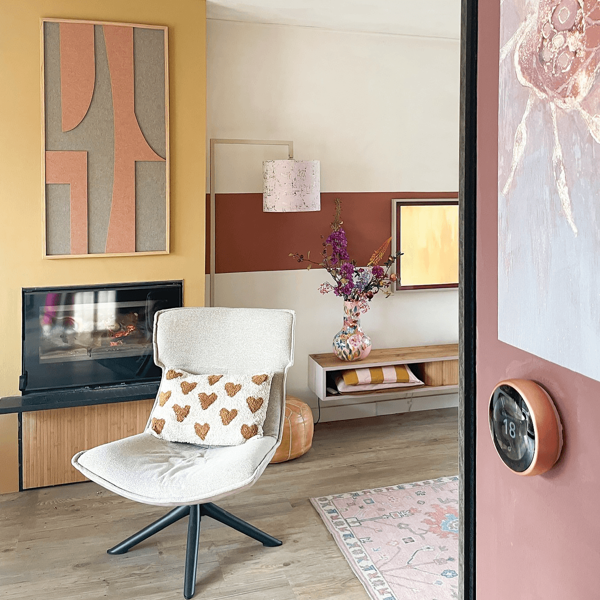
Energy and creativity with bright and warm colours
Do you want to create an inspiring and lively space? Opt for bold colours such as red, orange, or yellow. These shades stimulate creativity and energise the room, perfect for brainstorming areas, workspaces, or children's rooms.
Advantages of bright colors:
- They bring a dynamic and playful appearance.
- Ideal for stimulating activity and interaction.
- Perfect for spaces where innovation and creativity are central.

Rust and balance with neutral tones
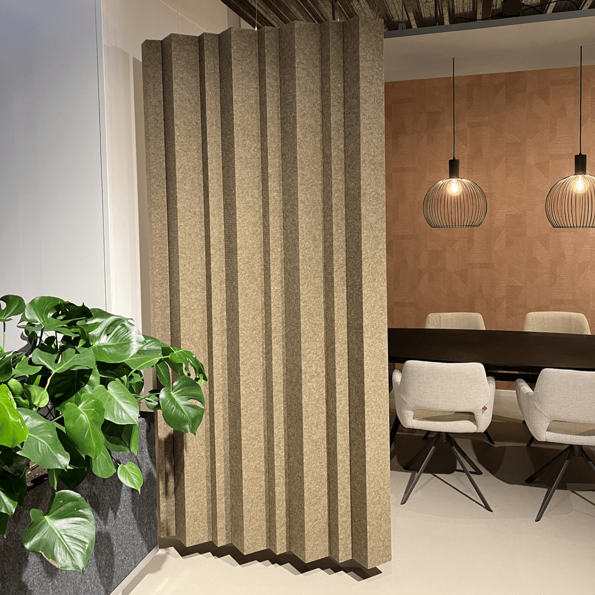
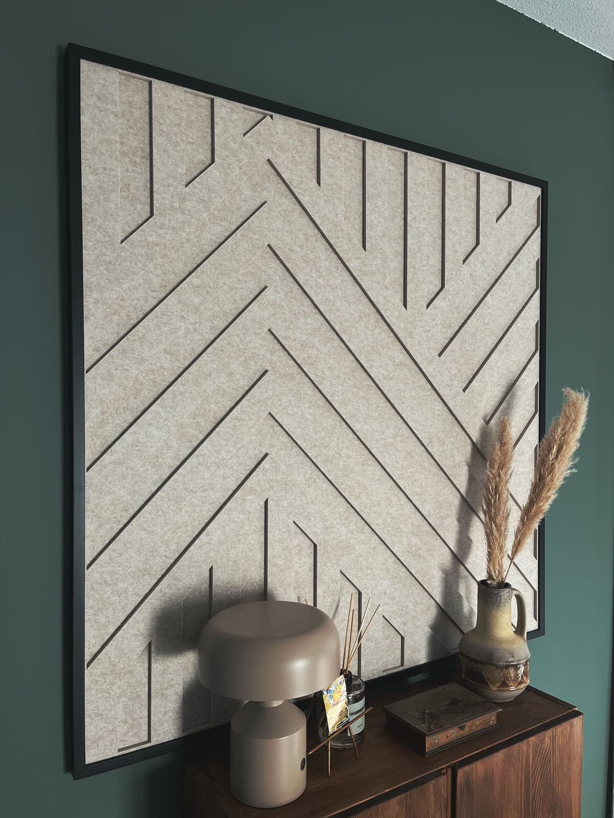
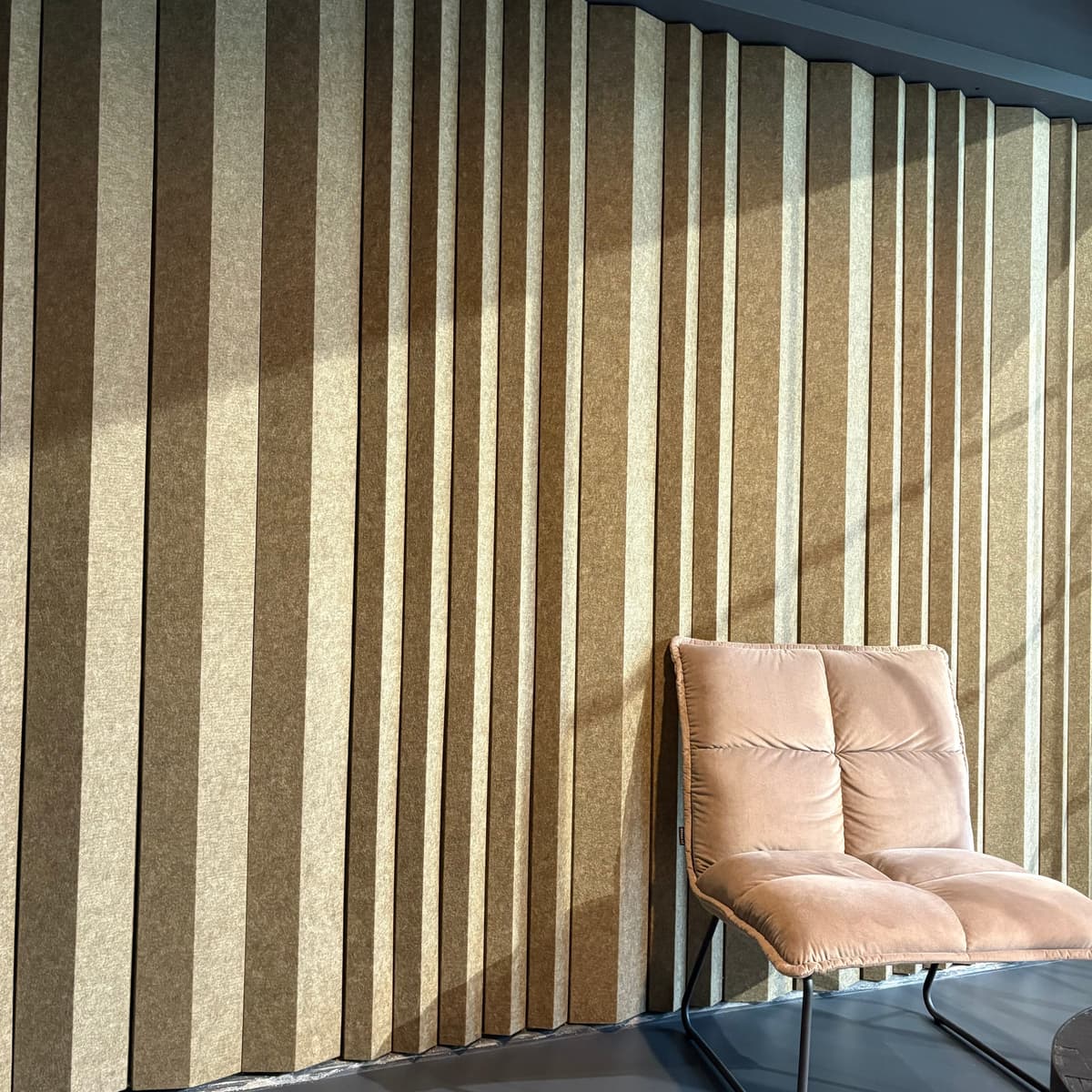
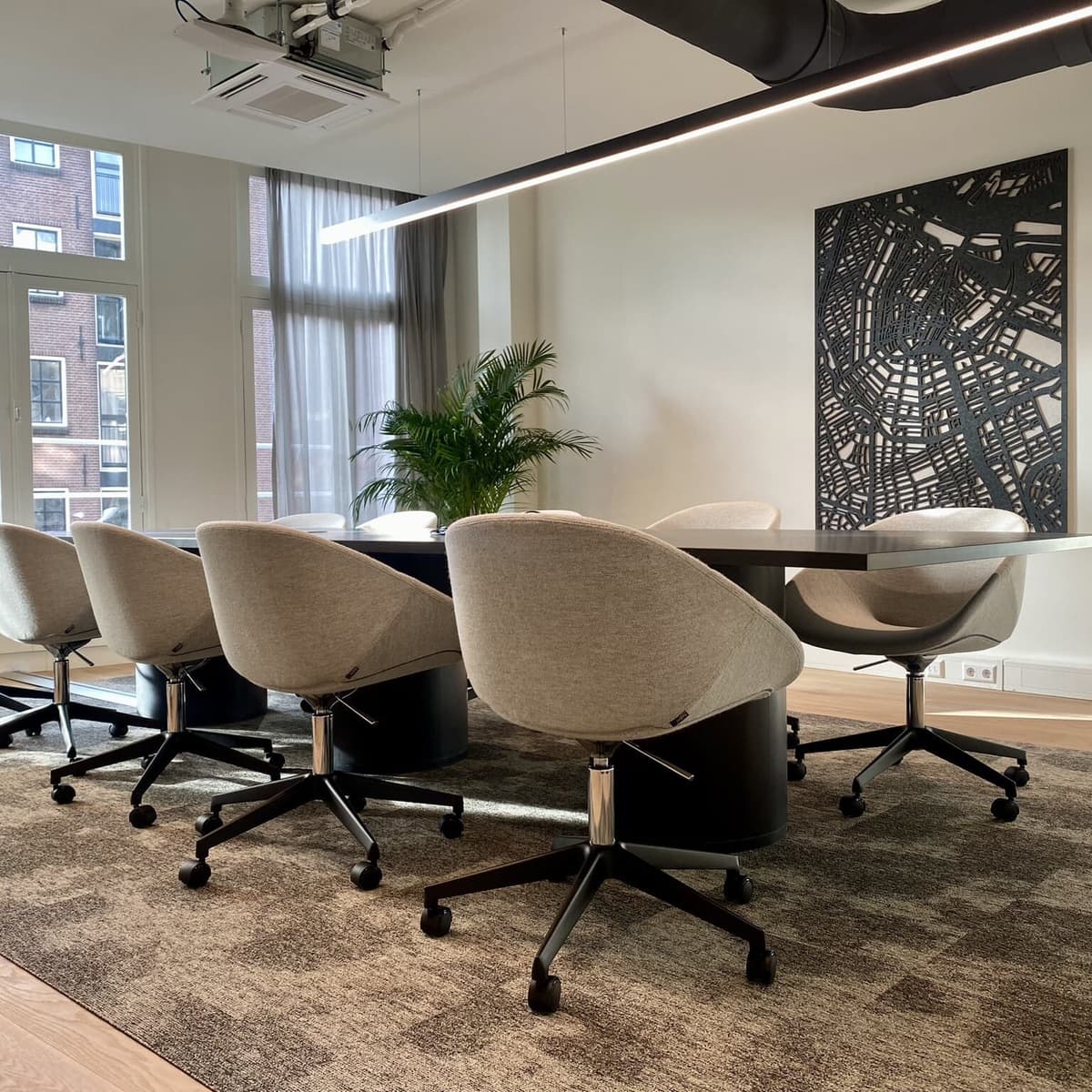
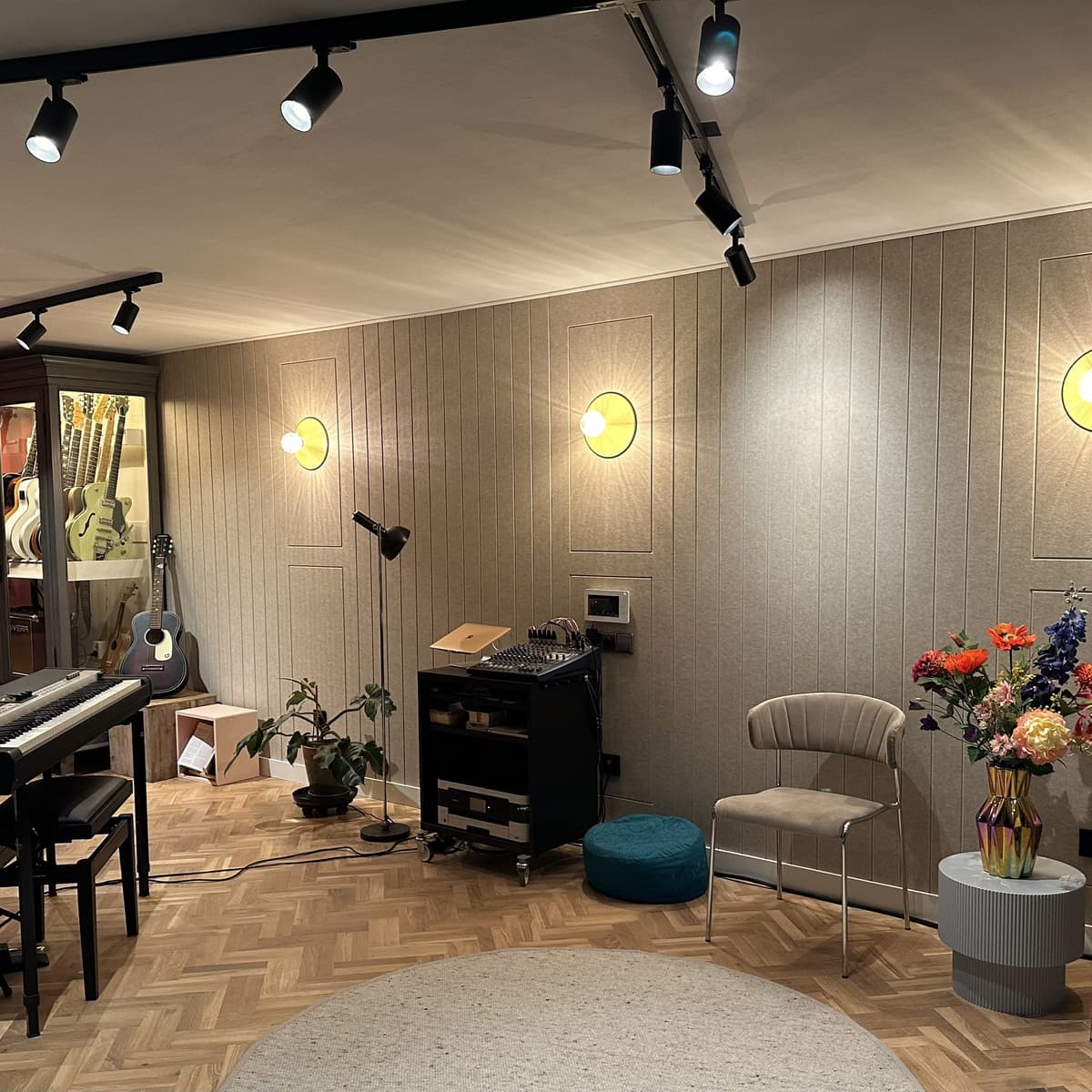
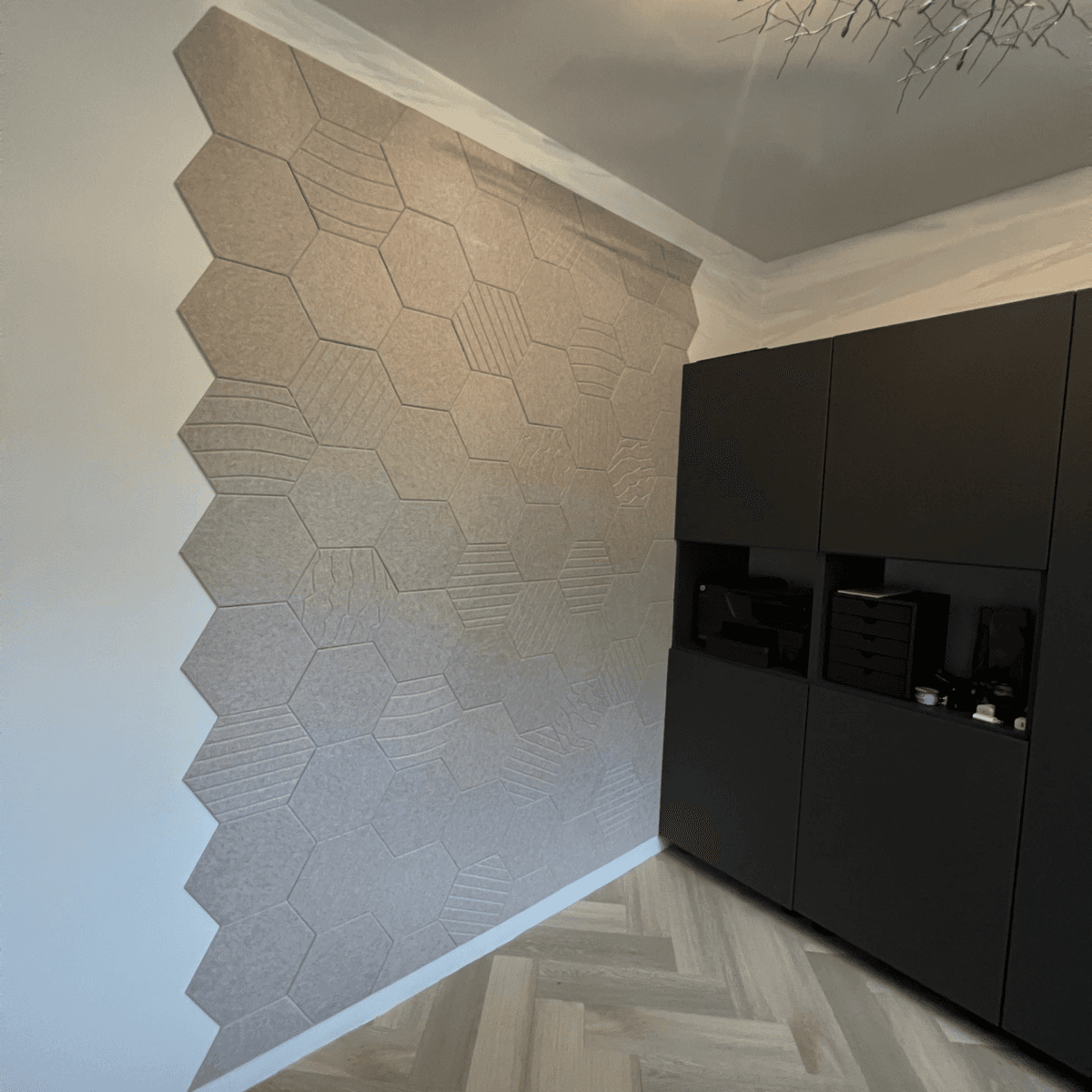
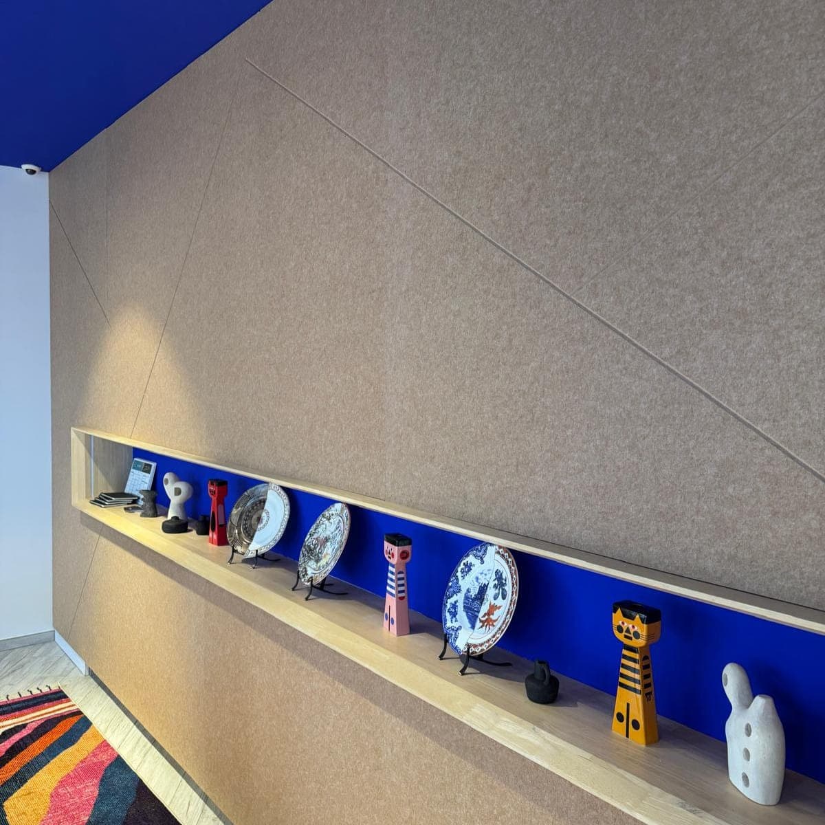
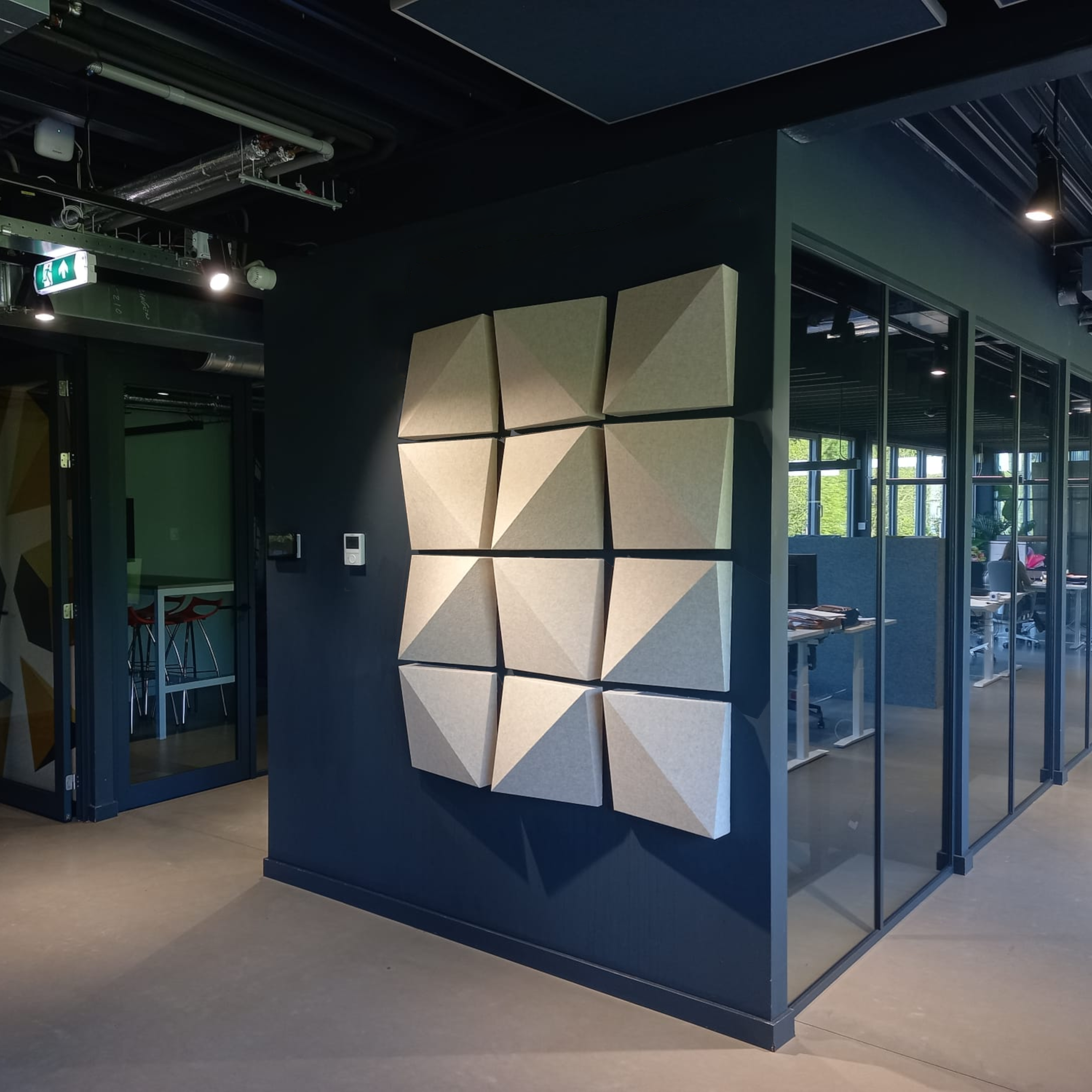
Neutral colours such as beige, taupe, white and grey create a calm and balanced atmosphere. They establish a timeless foundation and allow for playing with other accents without overpowering the space. Neutral shades are often used in areas where a peaceful, minimalist and professional appearance is desired, such as offices, reception areas and living rooms.
Advantages of neutral tones:
- They exude simplicity and elegance.
- Suitable for both modern and classic interiors.
- Easy to combine with bright or dark accent colours.
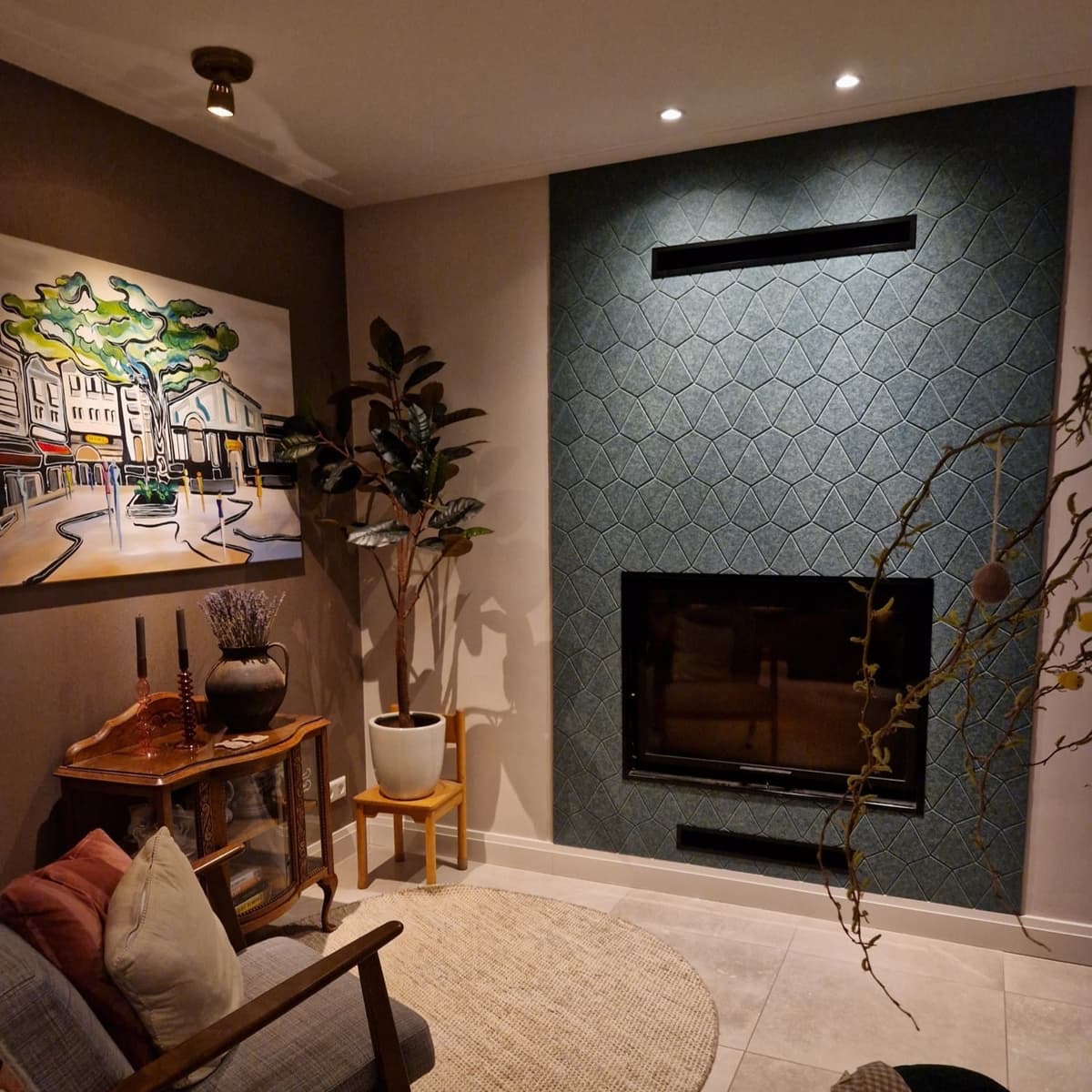
Freshness and focus with cool tones
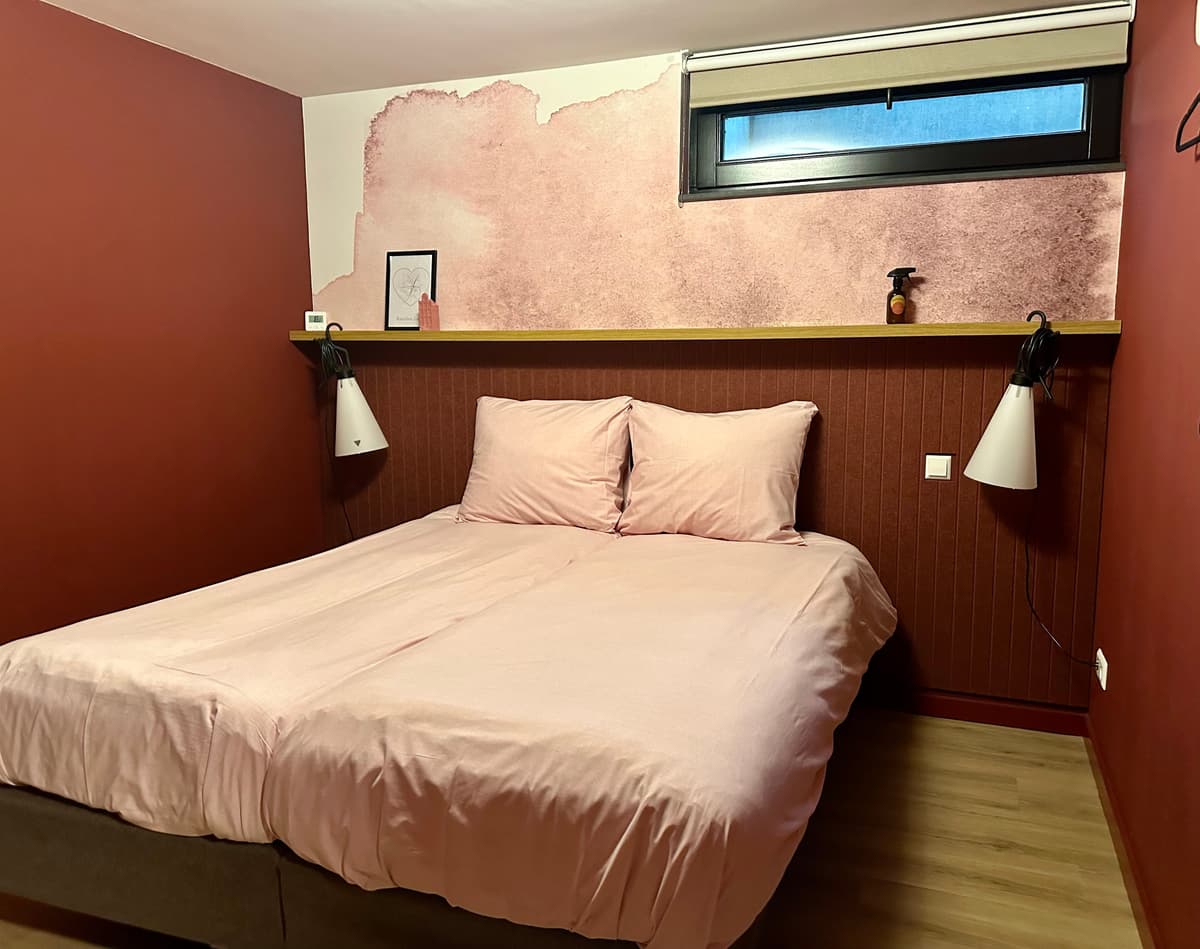
Cool colours such as blue, green, and soft purple have a refreshing and relaxing effect. These shades are perfect for spaces where concentration and clarity are important, such as bedrooms, work areas, and study rooms. Cool colours are often associated with nature and water, which creates a sense of freshness and relaxation.
Advantages of cool tones:
- Enhance concentration, productivity, and focus.
- Create a sense of calm and clarity.


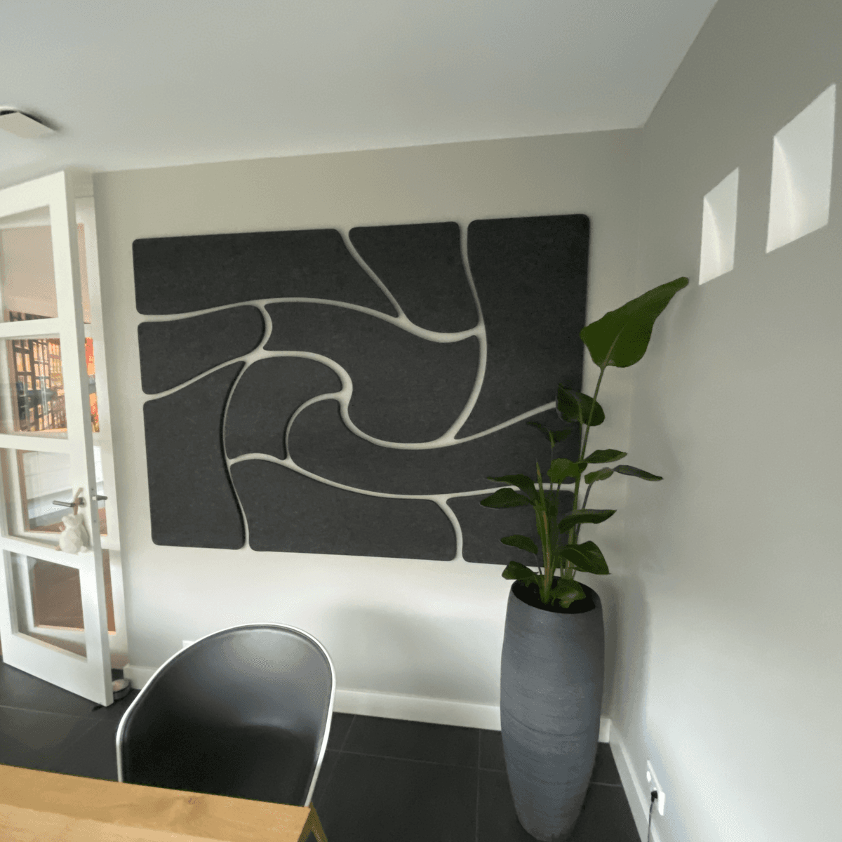
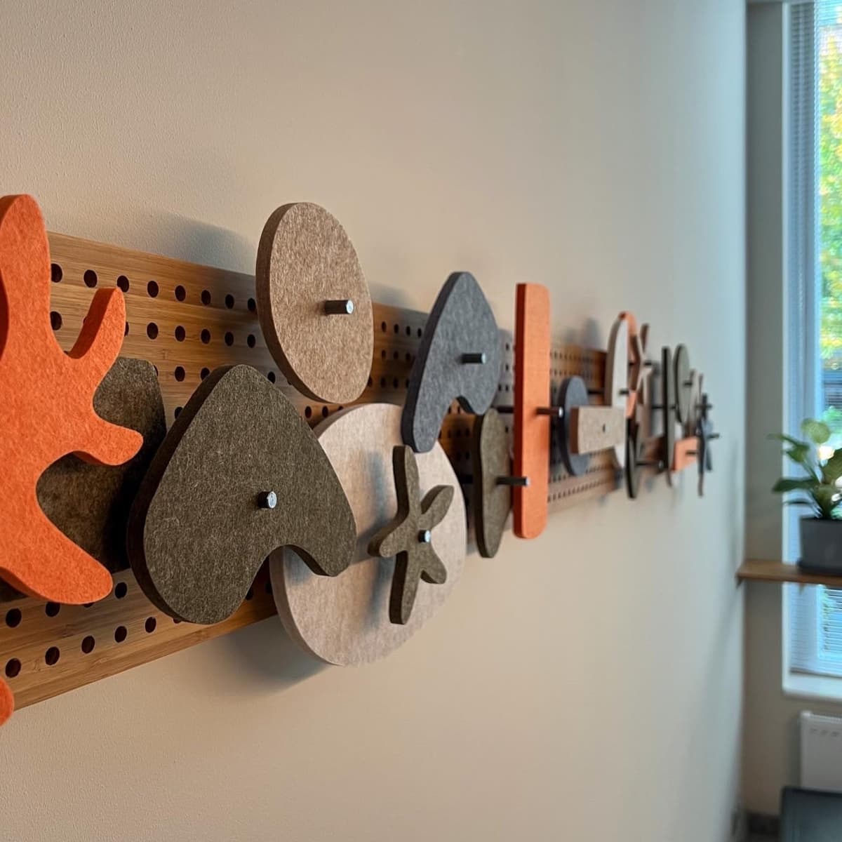
The role of felt wall coverings in enhancing colour perception
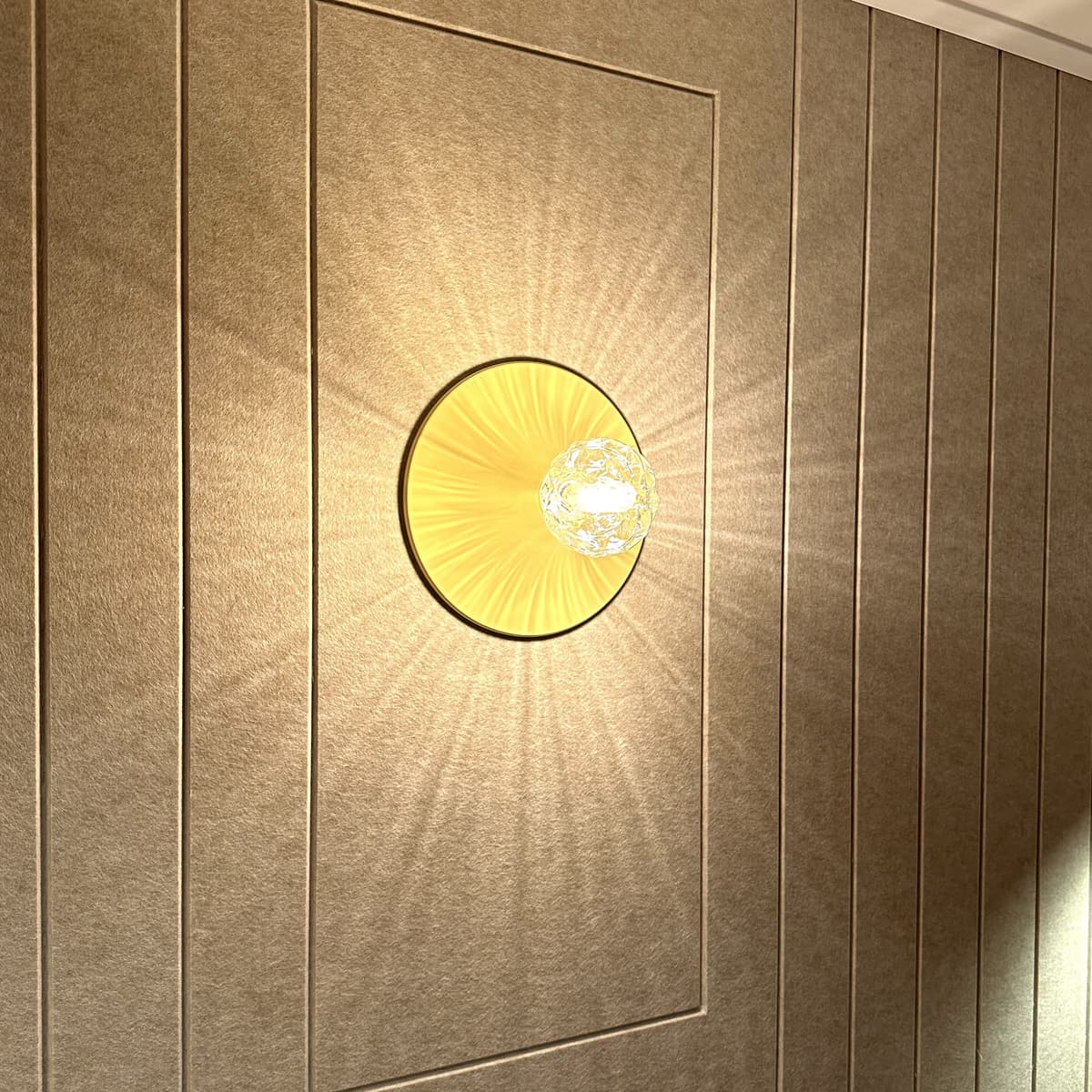
Wild wall panels have a unique matte and soft appearance that subtly and warmly enhances the colours.
Why felt wall covering is a good choice:
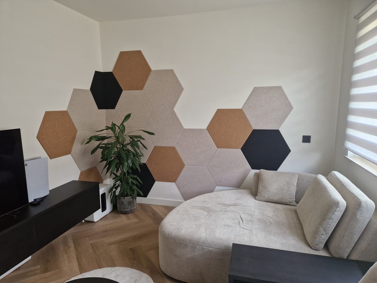
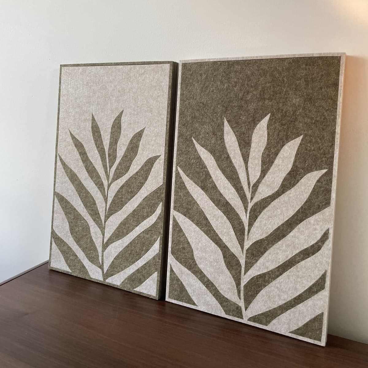
- Soft, cuddly texture: Felt softens bright colours and makes them less overwhelming.
- Versatile design possibilities: Create unique patterns and combinations for a personalised look.
- Acoustic benefits: Felt absorbs and dampens sound, ensuring a calm and comfortable environment.
- Durable and environmentally friendly: Made from recycled PET bottles, it has a long lifespan and is recyclable.
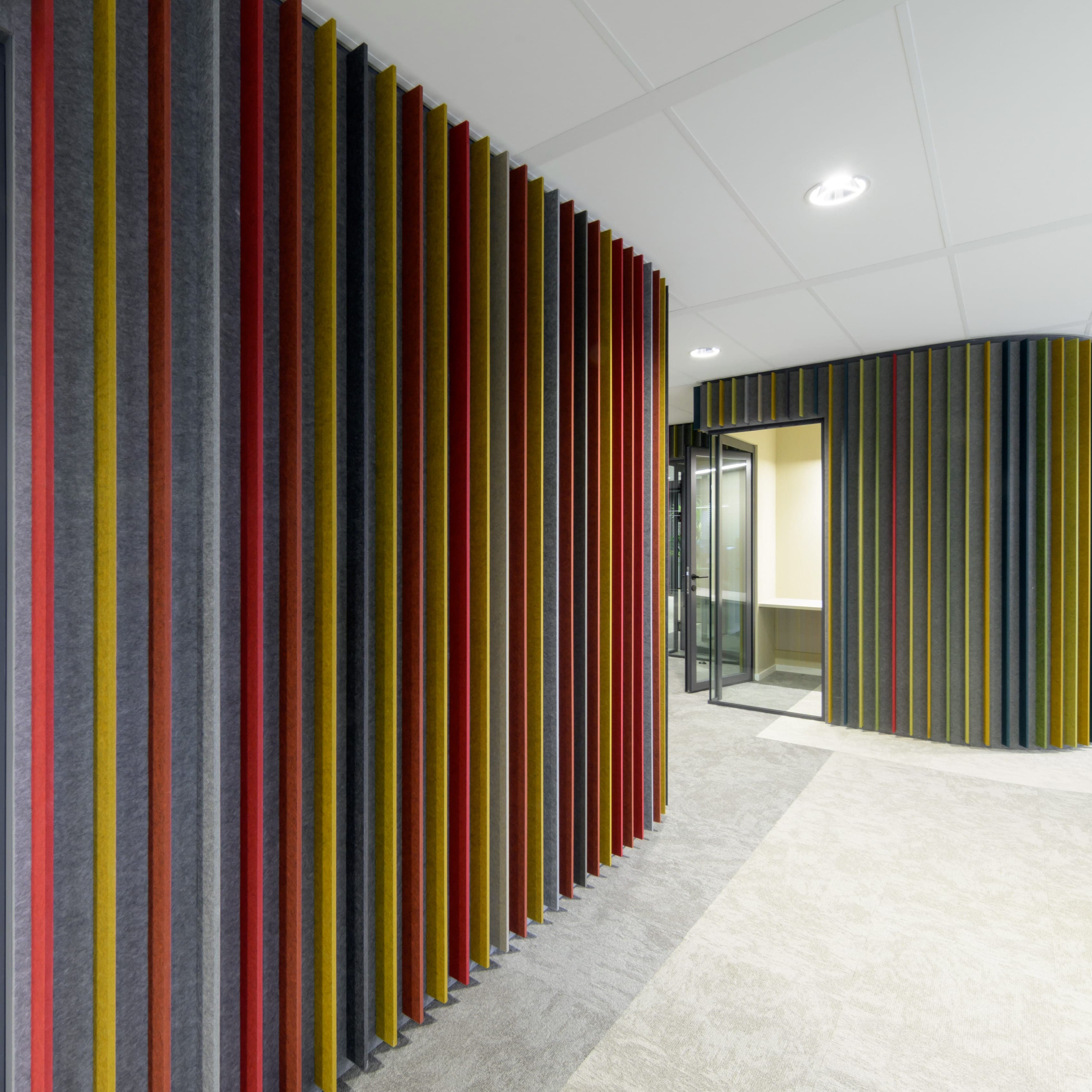
Combining colors with felt wall covering
Combining colors in an interior can have a significant impact on the appearance of the space. A few popular combination techniques are:
- Tone-on-tone: different shades of the same colour for a subtle and refined look.
- Contrasting colours: use of complementary colours such as blue and orange for a striking effect.
- Accent colours: a neutral base with a bold colour as an accent for a dynamic interior.


Practical tips for choosing the right colour
Choosing the right felt colour doesn't have to be difficult. Keep the following points in mind to make a good choice:
- Reflect on the function of the space. Choose calming colours for a bedroom and stimulating shades for a creative workspace.
- Consider the natural light. Natural light can make colours appear lighter, while artificial lighting may enhance them.
- Use colour samples. Test different colours in the space before making a final decision. We offer various sample cards with combined colour sets, ranging from neutral tones to vibrant, bright colours. Additionally, we also offer larger loose samples, which can be ordered per colour. This way, you can assess whether the colour of the felt panels matches your interior.
- Combine with furniture and accessories. Ensure that the chosen colour fits with the rest of the interior.
- Play with colours. Mix different colours for a cosy and personal look. A neutral base with a fresh accent colour can give that little extra, while tone-on-tone combinations create a calm and cohesive appearance.
Curious which color best suits your space? Request a sample or get inspired!